The Sketchbook Before the Screen
The sketchbook before the screen gives designers room to test visual ideas, notice patterns, and share the reasoning behind a developing concept.
Before a design becomes a polished screen, it may begin as a rough line beside a note: “too heavy,” “fold here,” or “try the opposite.” The sketchbook before the screen is not simply a place to draw by hand. It is a working surface where designers can make uncertain thoughts visible, revise them quickly, and invite someone else into the process.
Its value comes from what the page allows: loose combinations of image and language, unfinished alternatives, and a record of decisions that a clean presentation often hides. These five uses make a sketchbook more than a private warm-up.
1. A sketchbook lets an idea stay unfinished
A blank digital canvas can feel ready for a finished composition. A page in a notebook makes roughness feel ordinary. Designers can write a question in the margin, draw a shape that does not work, and leave room beside it for a different direction. Nothing needs to look presentable before it becomes useful.
That freedom matters when the brief is still being understood. A designer exploring a package might sketch the object as a silhouette, then add notes about how a hand opens it or where a label could sit. These marks are not competing concepts yet. They are ways to ask what the design needs to do.
Keep the page open to alternatives. If one direction seems convincing too soon, make a second version that changes its most obvious feature: the proportion, arrangement, or focal point. The contrast helps reveal which parts of the idea are essential and which are habit.
2. Words and marks can think together
Sketchbooks support combinations that are awkward to organize in a formal layout. A small diagram can sit beside a phrase, a material note, a color swatch, and an arrow pointing to a possible relationship. The page can hold these fragments before the designer knows how they fit.
Use words to make a visual mark more legible to your future self. “Softer edge” is more useful than an unexplained curve if you return to the page later. A note such as “quiet, not blank” can distinguish a deliberate visual restraint from an unfinished composition.
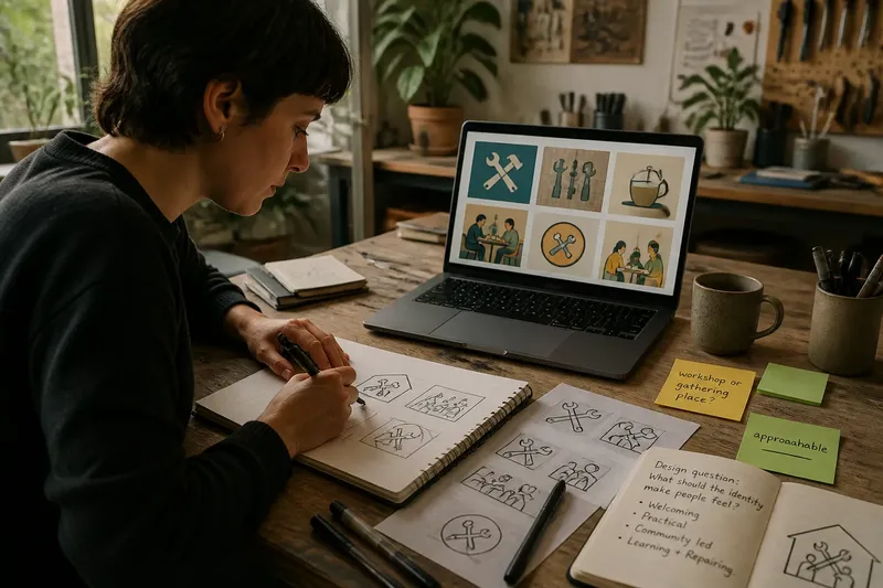
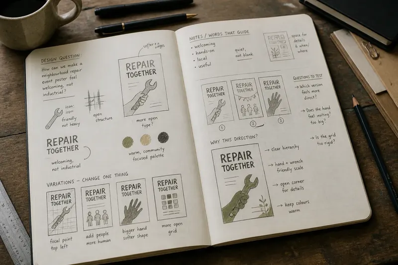
Imagine you are designing a poster for a neighborhood repair event. You sketch a wrench, a loose grid, and a bold title, then write “welcoming, not industrial” beside the image. That phrase gives you a reason to try a friendlier typeface and a more open arrangement when you move to the screen. The sketchbook has connected mood to a concrete design choice.
3. Repetition makes visual patterns easier to notice
One sketch can be an accident. Several variations reveal a preference. Repeating a shape, layout, or lettering idea across a page helps a designer see which forms keep returning and which only seemed appealing in isolation.
Try a small variation grid: draw the same basic object or composition in several boxes, changing one feature at a time. You might shift the focal point, simplify the outline, or change the direction of movement. Keep the changes visible rather than redrawing each attempt as if it were unrelated.
This is not a demand to produce a large number of options. It is a way to make comparison easier. When differences sit side by side, a designer can point to a specific quality—an open corner, a compressed word, a stronger silhouette—instead of relying on a vague sense that one version “feels right.”
4. A page can carry the reasoning into collaboration
A sketchbook starts as a personal workspace, but it can become a shared one. A page with alternatives and annotations shows how a question developed, not only which answer survived. That context gives a colleague or client something useful to respond to.
Before sharing a page, add enough context for another person to read it. Circle the current direction, label the alternatives, and write the question you want answered. “Which version feels more direct?” invites a clearer response than handing over an unexplained page and asking what someone thinks.
Keep the marks that explain the choice. A crossed-out option may show why a later one is simpler. An arrow can make the intended reading order clear. This turns the page into a compact account of the design’s logic, without pretending that every exploratory mark is a proposal.
5. Moving from paper to screen is a translation
The sketchbook does not need to compete with digital tools. It can help a designer decide what to build before opening layout software, a vector editor, or a prototyping tool. The move is a translation: the designer carries forward the useful relationships, not every pencil mark.
Choose what the screen needs to clarify. A rough drawing may establish the hierarchy of a page, while the digital version tests type, spacing, and how the composition behaves at different sizes. A note about a “soft” mood might become a decision about shape, contrast, or texture. Those choices can be revised on screen without losing the original question.
Photograph or scan the page when its annotations matter, then keep the image near the digital draft. That record can prevent a polished version from drifting away from the intention that started it. The paper remains a reference, not a template that must be copied exactly.
Which sketchbook habits help most?
Do designers need to be good at drawing?
No. A sketch can be a box, an arrow, a rough silhouette, or a few words beside a layout. Its job is to make a thought easier to inspect, not to demonstrate drawing skill.
What should go on the first page?
Write the design question in plain language, then add a few quick ways to interpret it visually. A clear question gives later sketches a useful point of reference without restricting the answers.
How can a sketchbook be shared with a team?
Choose pages that show a decision or useful comparison, and annotate them for readers who were not present while you worked. Share the question you are exploring so feedback addresses the design rather than the page’s rough finish.
Should every sketch be digitized?
No. Preserve a page when it contains an important idea, useful annotation, or decision history; leave routine exploration on paper if it adds no value to the next stage. A photo or scan is enough when the original only needs to remain available as a reference.
Let the page show what is still open
A sketchbook works best when it records both possibility and intent. Label the parts you want to carry forward, but leave unsettled areas visibly unsettled. That distinction helps collaborators contribute without mistaking every line for a finished instruction.
The sketchbook before the screen is useful because it gives visual thinking a form that can change and be read by someone else. Keep one page for the question, one for variations, and one for the marks that explain a decision. When the work moves to a screen, those pages can show not just what the design became, but what it was trying to find.