The Future Is Not a Mood Board
A design forecast needs more than striking images. Turn a mood board into a useful projection by defining its question, assumptions, and limits.
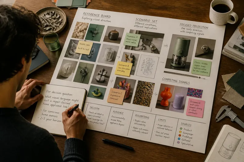
What decision should this design forecast help you make? A mood board can show the colors, surfaces, and forms attracting attention, but it cannot answer that question by itself. To make a projection useful, name the decision, state what you are assuming, and show how each image supports or challenges that reasoning.
This distinction matters when a team is choosing a visual direction, preparing a concept for a client, or trying to anticipate a change in design culture. A board can be an effective prompt for discussion. A forecast needs a claim about what may change, for whom, and under what conditions. The right approach depends on the job in front of you.
Start with the decision, not the images
Before collecting references, write one sentence naming the choice the forecast should inform. “What visual language might suit a repair-focused home appliance line?” is more useful than “What will design look like next?” The narrower question points toward relevant evidence and makes it easier to spot attractive material that does not belong.
Then identify the person or group making the decision. A product team deciding how to express durability needs different signals from a cultural organization planning an exhibition identity. The same image might inform both conversations, but it supports different claims in each.
Keep the question open enough to allow a surprising answer, but specific enough to rule out unrelated references. If your question could apply unchanged to a fashion collection, a software interface, and a furniture launch, it probably needs a clearer audience or design context.
Choose an approach that fits your situation
A decision guide should reflect the uncertainty you face, the time available, and what the work needs to produce. Use the approach that fits the situation rather than treating every board as a forecast.
- You need a shared visual direction for a current project. Build a reference board, not a future forecast. Group images by qualities the team can discuss, such as contrast, texture, visual density, or the relationship between type and image. Mark which references are prompts and which are constraints. This fits when the decision is about a coherent direction now, not a claim about what a market or culture will do next.
- You need to prepare for several plausible shifts. Make a scenario set. Write distinct conditions that could shape the design, such as increased demand for repairable products or a stronger preference for low-stimulation interfaces. Pair each condition with visual implications and explain what would make that scenario more or less relevant. This fits decisions that should remain adaptable because the underlying conditions are unsettled.
- You need to advise on one likely direction. Make a focused projection. State the trend claim, identify the evidence behind it, and specify the audience and context. Show competing signals and explain why you judge one direction more useful for the decision. This fits when a team needs a clear working direction but should still understand the uncertainty behind it.
- You are exploring ideas without a decision-maker or defined audience. Keep the board exploratory and label it that way. Use it to gather questions, notice recurring visual traits, and identify what evidence is missing. This fits early discovery; it does not yet support a confident forecast.
Say “reference board,” “scenario set,” or “focused projection” in the project notes. The label tells readers what kind of conclusion they should expect.
State assumptions so the forecast can be challenged
A projection rests on assumptions whether or not the author writes them down. Make those assumptions visible. They might concern the intended audience, the design context, the conditions likely to persist, or the time horizon relevant to the decision. Avoid treating any of these as settled facts when they are judgments.
Separate what you observed from what you infer. For example, “Several recent product images emphasize visible repair features” is an observation about the references you collected. “Visible repair features may become a stronger signal of product value for this audience” is an interpretation. The first does not prove the second.
Say what your materials cannot establish. A selection of brand campaigns may show how those brands want to be perceived; it does not, by itself, tell you how customers feel or what they will buy. Product images can reveal a design vocabulary, but not the business reasons behind it. Naming such limits helps a team use the projection without asking it to answer questions it was not built to answer.
Imagine a small kitchenware team asking whether a repair-oriented visual language should shape a new product family. The team gathers images of visible fasteners, replaceable components, and clear maintenance diagrams, then notes an assumption: the intended buyers value signs of serviceability when choosing appliances. The team distinguishes those visual references from actual evidence of buyer preference and proposes checking that preference through appropriate customer conversations before treating the direction as settled. The projection gives the team a useful design question, not a promise about demand.
Make the board explain its own evidence
Give each image a short caption that connects it to the forecast. A caption might say, “Exposed joints make repair part of the product’s visible identity,” or, “This restrained palette may suit a setting where visual quiet matters.” Avoid captions that merely name a color or material; the image already shows those.
Include signals that complicate your preferred direction. If your board argues for visual restraint, include references showing renewed interest in ornament or expressive color, then explain why those signals do or do not change the projection. A board that contains only confirming images may look coherent while concealing a weak argument.
Record where each reference came from and what kind of source it represents: a finished product, a campaign, a prototype, a cultural image, or a designer’s speculation. These are not interchangeable. A prototype may indicate an ambition; a widely used interface may indicate an established convention. Source notes let readers judge the difference.
Use the board’s layout to clarify relationships, not to imply certainty. Put images together when they support the same claim, and set contrasting signals apart when they point elsewhere. A visually polished arrangement can make uncertain evidence appear conclusive, so keep the reasoning legible beside the imagery.
Questions to settle before you present the projection?
How is a forecast different from a mood board?
A mood board collects references to establish or explore a visual direction. A forecast adds a defined question, a reasoned claim about possible change, and stated assumptions that readers can inspect.
How many visual directions should a projection include?
Use as many as the decision requires, not a fixed number. A current project may need one working direction, while a decision under greater uncertainty may benefit from distinct scenarios and the conditions behind each.
Can a forecast rely on images alone?
Images can make visual signals easy to compare, but they rarely explain who is adopting them, why they matter, or how representative they are. Pair them with source notes, observations, and clear limits on what the material supports.
When should a team revise its projection?
Revisit it when an important assumption changes, when new evidence conflicts with the central claim, or when the decision itself shifts. A projection is a working aid, not a permanent description of what comes next.
Present uncertainty without weakening the work
Direct language is more useful than false confidence. Write “This direction may suit teams seeking a more repair-oriented identity” rather than “Repair will define the next era of product design.” The first sentence ties a possibility to a context; the second makes a broad prediction without showing its basis.
Make the projection actionable by stating what a team can do with it. It might guide a set of early concepts, prompt a discussion with customers, or help a creative director decide which visual territory to explore. It should not be presented as proof that an audience will respond in a particular way.
Keep the main claim short, then use the supporting material to qualify it. A reader should be able to tell what you believe may change, why you think it matters, and which assumption could alter your view. If any of those points is missing, revise the reasoning before polishing the board.
Leave the reader with a decision they can use
A useful design forecast does not need to predict every future style. It needs to help a specific reader make a better-informed choice under stated conditions. That may mean choosing one direction, keeping two scenarios open, or deciding that the evidence is not ready to support a forecast.
Before sharing the work, ask whether someone who was not in the room can identify the question, distinguish observation from interpretation, and see what would change the recommendation. If the answer is yes, the images are doing more than setting a mood: they are helping the reader think through a decision.
That is the practical test for a design forecast: the reader can act on its claim while still seeing the assumptions that hold it up.